Stoke City: New shield revealed

There are many English football clubs that are overdue a redesign of their logo. Southampton, Birmingham City, AFC Bournemouth, Coventry City... None of them currently have a particularly bad logo; it just feels like each one is a relic of a bygone age that no-one seems able to improve on.
Just over a week ago, Stoke City announced that they were finally in a position to change their branding after a long period of consultation with the fans and other invested parties. Due for introduction at the start of the 2026-27 season, it sees a return to the quartered shield that was used between 1977 and 1992. Much like contemporary football kit design, the only way to go forwards, it seems, is to go backwards.
Quite to what extent the Staffordshire club actually needed to change their logo is open to debate. Stoke’s current badge has been in use since 2001 and is admittedly basic in its presentation of little more than a shield, some perfunctory text and some red and white stripes. How wise it is to pare down your visual identity to just those coloured stripes when you’re not the only team wearing them is open to discussion, but the logo does at least look neat and professionally executed.
Having tolerated neatness for just over a quarter of a century, it seems Stoke City are adopting a more ambitious approach this time. With the help of design agency Drummond Central, they’ve reinstated and updated a badge which itself only lasted for 15 years in its original form. From next season, The Potters will still have a shield, but this one has more for the eye to engage with.

The new logo is wider and more squat than the current version, but it has a more historic feel that should have greater appeal to fans far and wide. The changes that have been applied are mostly cosmetic and apply some necessary spit and polish to the original.
Replacing the club’s ‘SCFC’ initials is its name, and it’s shown in a modern serif font at the top of the shield. The font itself is bold and easy to read, but I can’t help feeling that it needs to be a little taller, thereby gaining more importance in comparison to the imagery below it. More on that shortly...
Then there are the four quartered compartments that create a visual connection to the city of Stoke and its team. As the pottery capital of the UK, it’s not much of a surprise to see a bottle kiln, and the presence of a Stafford knot provides an extra clue as to the club’s location. Both now have grey shading for extra definition, although one would expect it to be absent in certain situations where a more limited colour palette is enforced. In a further change from the 1977-92 version, the kiln now resides in the bottom-right of its quarter section - a move that looks much better than the original, where the kiln looked more like a lunar module hovering precariously in space.
Back in the days of Adrian Heath and the late Paul Johnson, two quarters of the badge were set aside for displaying the red and white stripes the club is well known for. Next season, it’ll be just one; the other will now show the year of the club’s formation, 1863, in golden yellow on a solid red background. This might seem like an unnecessary indulgence or proof that the designers didn’t know what else to put in that corner of the shield. It’s only when you realise that Stoke City are actually the second oldest professional football club in existence that one understands why the club wants to promote its age in this way.
The whole thing is rounded off nicely with a pleasing yellow outline running parallel to the outside of the shield, and generally speaking you have to say the new logo fits better with the modern-day football aesthetic. It’s not quite perfect, though. I’d like to have seen a slightly taller shield that’s more in keeping with the dimensions of the version used between 1992 and 2001. Mind you, that one only lasted nine years, so what do I know...
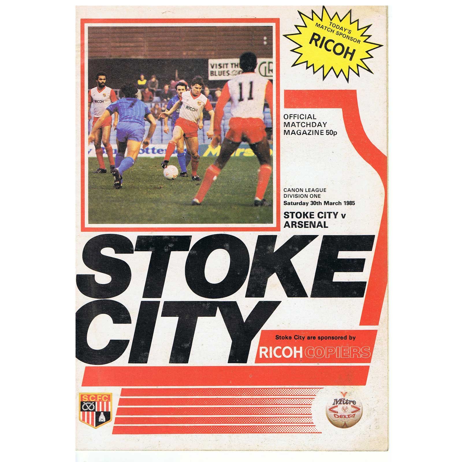
Simon King, Chief Operating Officer at Stoke City commented: “The crest is an integral part of the Club’s heritage and this will, therefore, go down as an historic moment for Stoke City,” and technically he’s right. Yet it’s also worth pointing out that during my lifetime, Stoke have had three distinctly different logos or badges, and that’s without including the version used on the BBC’s Match of the Day in 1985 that also appeared on the club’s match-day programme. For something to be looked back on as truly historic in the future, it needs plenty of time to be appreciated and loved by the fans. Changing the crest on a regular basis prevents that from happening. Let’s hope this new design is resilient enough to resist replacement any time soon.