
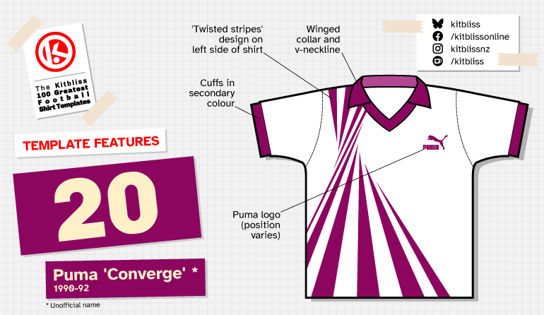
20. Puma 'Converge' (1990-92) *
Chris Oakley | 19 August 2026
If you'll excuse the quite blatant plug, I recently started a new Kitbliss series called Kits at the Crossroads. The aim of the series was to focus on those football matches where it seemed one team was wearing an almost impossibly modern kit against opponents whose kit looked outdated by default. The shirt Austria wore during the 1990 World Cup would be ideal for any such article, for they could have played any other team that year and appear like visions from an unknown future.
Austria's home and away shirts were based on a template that made one think that football shirt design had reached its zenith at the start of the 1990s. That it came from Puma might have been a little surprising at the time. The German kit supplier had for many years produced football shirts that were nicely styled but hardly revolutionary. That all changed in the late 1980s, when Puma adopted a noticeably different approach. Someone at Puma clearly thought it was time to rip up the rule book, and the Austrian national team were one of the first beneficiaries.

Starting with a friendly match against Egypt in February 1990, their traditional white home shirts now featured a series of thin black stripes down the left side that seemed to have been twisted from either end. This effect created a point of convergence around the area where the manufacturer's logo often appears which, on some versions, is where Puma put theirs.
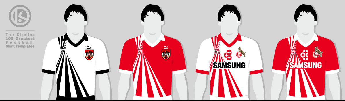
From left: Austria (1990-91 home and away), Köln (1990-91 home, 1990-92 away).
Having never closely followed the Austrian national team, I wasn't really aware of the design until they played Italy on 9 June 1990. Italy's shirts looked classy, if a little old-fashioned, and that's why I spent most of my time not looking at them. Austria's shirts were mind-blowing, almost to the point of deserving a one-goal head start for Josef Hickersberger's team. This was a design that immediately had a claim to being the best of the tournament, and were it not for those pesky West Germans in their Adidas gear, they may have convinced virtually everyone.
Better still for the 18-year-old me, Austria's red away shirt bearing the same design soon appeared in their last group game of Italia 90 against the USA. I appraised it with just as much delight as the home shirt, a sure sign that the template presumably worked brilliantly in any colour combination. Unless you were a particularly avid and meticulous follower of world football around this time, however, you wouldn't really have been able to prove so.

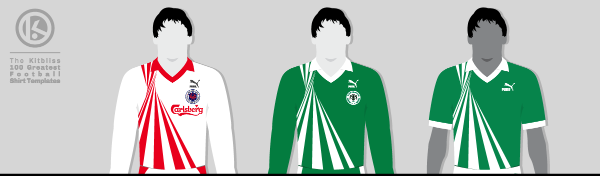
From left: Hong Kong (1992 away), Konyaspor (1990-91 home), Libya (1992 home).
It's sadly one of the great frustrations for any football shirt fan that comparatively few teams wore this template. Of those I've discovered, red and white are the colours that appear most often. In the Bundesliga, Köln followed Austria's cue with a white and red home shirt, reversed for the away shirt. The Hong Kong national team wore a home shirt that was almost identical to Köln's, but included a Carlsberg sponsor logo in the white space.
Luckily not every team was so like-minded. Turkish club Konyaspor wore a very fetching green and white version, as did the Libyan national team, but what I've just described is virtually the full spectrum of colour combinations for this template. If you were hoping to see what it looked like in, say, blue or yellow, you'd be out of luck. That said, Jamaica wore someone's imitation of the template against Mexico, but that was a full five years after anybody else. Quite who made their shirt is anyone's guess as it's devoid of any visible branding.
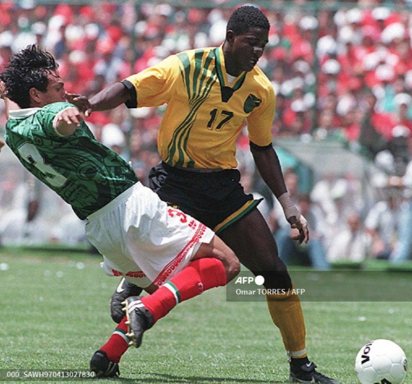
Mexico v Jamaica (1997). Image: AFP.
All of which begs the question: 'Why didn't more teams join the Austrian bandwagon?' I can think of two possible answers. Firstly, the sheer modernity of the template would have been too much for many teams to contemplate, even if football shirt design was getting more flamboyant at the time. Secondly, as Köln found out, the need for a main sponsor logo somewhat diminished Puma's marvellous twisted stripes. Across two seasons, they sported the branding of Samsung and Citibank, both of which failed to give up an inch of valuable real estate on the shirt.
The life of this magnificent shirt template was all too brief, but to have appeared in a World Cup and the DFB-Pokal Final of 1991 (when Köln faced Werder Bremen) is quite an achievement. Had Sheffield Wednesday been the first English club to wear Puma in 1990 rather than 1993, we might have seen the template in the Football League too. If only.
Thirty-six years ago, I hoped all new football shirts would look as fresh and exciting as this one. I thought we might see a new dawn, with an explosion of ideas and originality woven into the threads of our favourite teams. Yes, we saw new ideas, creativity and originality, but few could claim to have ripped up the rule book like this masterpiece. Long may its memory live on.
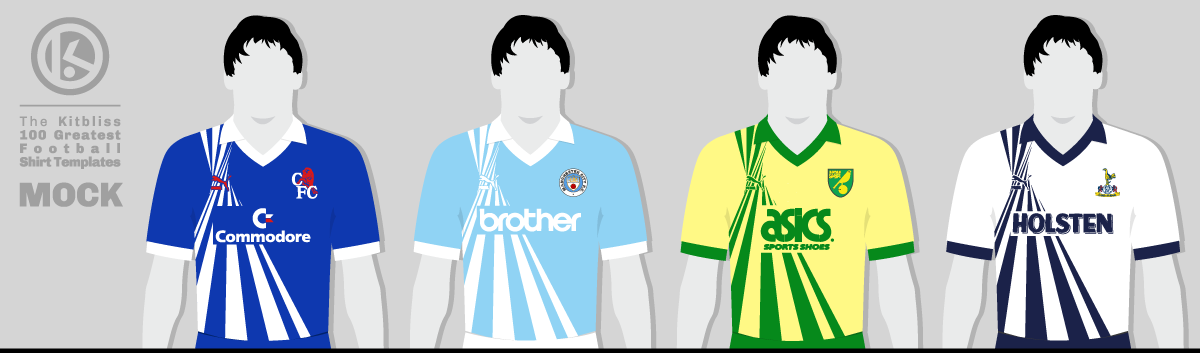
What might have been... From left: Chelsea, Manchester City, Norwich City, Tottenham Hotspur (circa 1990-91).
My very grateful thanks go to Adam's Shirt Quest and Football Shirt World UK for their help in researching this template.
To see the full set of Puma 'Converge' * kits, visit the Puma 'Converge' * template gallery page.
(* unofficial name)