62. Reebok 'Elevate' (1993-99) *

Chris Oakley | 3 January 2023
Once again, I find myself in the unenviable position of having to illustrate and discuss a football shirt template that barely conforms to any rigid set of rules. Despite this, it has become perhaps one of the most instantly recognisable templates among football fans the world over. Another flagrant example of corporate grandstanding, I bring you Reebok 'Elevate.' *

From left: Andorra (1998 home, 1998-99 away); Bastia (1996-98 home, 1996-97 away).
Let's start with the strongest detail of the design which, in many ways, is the most confusing - the big Reebok logo that's plastered right across the top of the shirt. Upon first sight, you instantly know what the motif is, although, much like this template, it doesn't seem to have an official name. Nike has its Swoosh, so what do we call Reebok's logo? I guess they're a British company and the symbol looks like an exit on the motorway, so maybe it could be named the Brex... no, maybe not. Actually, it's sometimes referred to as the 'Vector,' so I'm led to believe. Not very funny, but true.
Upon closer inspection, one can see that the big Reebok logo actually varies in shape and form, depending on the team wearing it. On some, the upper-right part of the logo ends in an upwardly angled point on the right shoulder (face on), whereas on others, it droops flacidly down the right arm. Then there's the two 'legs' in the bottom-left of the logo. Sometimes they end at the left armpit, but sometimes they fall down the left arm towards the cuff. When the time came for Chile to take part in the 1998 World Cup, those 'legs' were removed altogether, presumably to minimise such blatant branding in FIFA's showpiece competition.

From left: Bochum (1994-95 home and away); Chile (1998 home, 1996 away).
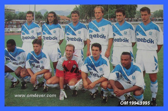
There was even a modified version once worn by Olympique de Marseille (along with the version featured below). It had a much bulkier, simplified version of the Reebok logo that was partnered with the company's wordmark as main shirt sponsor... just in case you still weren't sure who you were dealing with.
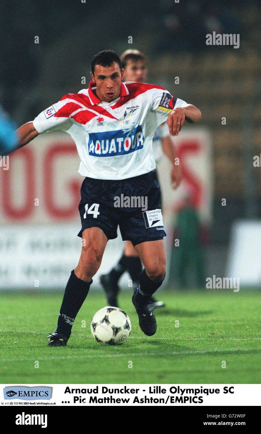
Continuing on a similar theme, the small Reebok manufacturer's logo (for that was deemed a necessary inclusion too), seemed to take many forms and appear in many places. Marseille tended to display the wordmark and vector in a linear style, tilted to run in parallel with the downward point of the big logo. Bastia, meanwhile, did the same but with the wordmark only. Then there's the full logo with wordmark above the Vector. Andorra wore that version centrally, while Chile wore it on the left shoulder, Costa Rica and Ecuador wore theirs on the right shoulder, Lille wore theirs on the right breast... Oh, and Bochum wore just the wordmark on the right breast while Neuchâtel Xamax wore it on the right shoulder. So much for continuity...

From left: Costa Rica (1995 home); Ecuador (1993-94 home); Lille (1996-97 home and away).
Like Adidas before them, Reebok realised that such an exercise in unavoidable branding needn't stop with the shirt. On many of the accompanying shorts, yet another Vector was included on one leg. Even the socks weren't left out, as many would include a Reebok logo rotated 90 degrees too. With kit suppliers only likely to dare an approach like this once, it's perhaps only natural that they'd go all in with as many logos as possible while they've got the chance.
Thankfully, this template was more than just an exercise in extreme commercial marketing. Elsewhere on the shirt, there was ample opportunity for teams to change other features to suit their preference. Chief amongst these was the collar which could be rendered in several styles. There was a simple wrapover v-neck as worn by Costa Rica and Ecuador, or a wider version as favoured by Marseille. Other collars were winged, decorated in a variety of ways from a simple lined trim to the more intricate series of diagonal dashes worn by Chile and FC Utrecht. In the case of the former, that same motif was also used on the cuffs - the only time they were embellished within this template.
/cloudfront-us-east-1.images.arcpublishing.com/eluniverso/BHTH4AFLXRD2XM5ZR5YC2VT3Y4.jpg)

From left: MyPa (1995-96 home); Neuchâtel Xamax (1995-96 home); Olympique de Marseille (1995 home); Russia (1993-95 home - version 1).
There were also shadow patterns to choose from, alongside the plain fabric option. Two main patterns were more popular than any other; repeating shadow stripes, and a diagonal grid featuring (you guessed it) Reebok logos and diagonal dashes. When caught by the light striking at a particular angle, the stripes could be a little distracting from the essential shirt design and were perhaps better suited to a light (or better still, white) background colour.
Given the overall perceived lack of subtlety about this template, it proved to be surprisingly well liked by clubs and countries alike. French league football was undoubtedly where you'd have found many versions, a fact made all the more remarkable given the tendency to flood kits with sponsor logos in that part of the world. When you've got a massive Reebok symbol as a starting point for the design, you do wonder to what extent the smaller sponsors felt overshadowed by comparison.

From left: Russia (1994 home - version 2, 1994 away, 1993-94 third).
Where national teams are concerned, Russia and Chile wore their designs the longest. The 2018 FIFA World Cup hosts had the distinction of not only wearing the template as home, away and third kits, but also in an alternative home kit that was white with red detailing. Ironically, it looked not unlike Chile's away kit (albeit without the blue collar).
Although I've illustrated 23 different versions of the template here, there were undoubtedly many others I could have included or chose not to mention. For a design with so many subtle differences from team to team, it was difficult drawing a line to say what was based on the core template and what wasn't. One example is the Brazilian club Fluminense. Their 1994 away kit looks, at first glance, to be the same as many of those mentioned. On further inspection, however, the big Reebok logo looks slightly enlarged and therefore not quite the same as the others.

From left: Toulouse (1997-98 home and away); Utrecht (1996-97 home, 1996 away).
Similarly, Penarol's 1998 away shirt, striking as it looks in black with yellow details, also has a larger-than-normal Reebok logo, not to mention a collar style not seen elsewhere. As for Ecuador, I've found an image of a blue away kit being worn in 1994, but I couldn't say for certain if it was the full Ecuador team wearing it. For all I know, it could have been their Under-21 team. Either way, like other such examples, we can at least marvel at what might be valid until further confirmation arrives.
And that neatly underlines what a great design this is. More often than not, bold designs work better than subtle ones, and they don't come much bolder than this one. Whatever the colour palette, whatever the team, Reebok made their mark emphatically with this template that always grabs your attention and is reluctant to let go.
To see the full set of Reebok 'Elevate' kits, visit the Reebok 'Elevate' template gallery page.
Update:

I'm very grateful to FSWorld on X, who contacted me to say that the El Salvador men's national team wore the Reebok 'Elevate' template around 1996. Some versions of the shirt even appear to have a noticeably large oval-shaped sponsor logo in the centre, but to what extent that was worn in official matches is unclear.
Anyway, that aside, I've illustrated the El Salvador men's team home kit and added it to the Reebok 'Elevate' template gallery with my sincere, thanks once, again to FSWorld.
See also:
* Unofficial template name