
Now that we’ve had time to let the shock sink in, what do we think of this season’s Juventus home kit? As one half of a double act that also saw Barcelona turn its back on tradition in no uncertain terms, Juve’s new outfit was daring or disrespectful depending on who you asked.
‘Be the stripes’, Adidas asked of the Turin club’s fans, but presumably the vast majority were perfectly happy just to wear some rather than be some as was traditionally the case. So does the new half-and-half shirt work and can any stripe-wearing team ever adopt the halves successfully?
The answer, I believe, lies in the team itself. If it has predominantly worn stripes, stripes and nothing but stripes for decade after decade, the answer will likely be ‘no.’ If it dabbles with stripes, plain shirts or other designs, perhaps the fans will be more forgiving.
To prove the point, I’ve tried to emulate the kits that a number of stripe-wearing teams would be wearing if they’d switched to the Adidas design currently favoured by Juventus.
The Juve kit is striking in its simplicity. White and black halves are separated by a pink vertical band, and the sleeves are in alternate colouring to the body of the shirt. The traditional Adidas three-stripe trim appears on the shoulders, shorts and sock turnovers, while the pink band is rotated 90 degrees mid-way down the socks. The shorts and socks are black but have already been worn in white which looks equally as pleasing to the eye.
All in all, a very nice kit design indeed, but when it’s worn, do Juventus look like Juventus? It’s a silly question in many ways, but a vital one. By changing a football kit so radically (even if only for one season), does it make a team look like someone else entirely?
In this case, one could argue in the affirmative. The black and white colouring is there as ever, and the addition of a pink accent colour isn’t that controversial given that the colour dominated Juve’s shirts in the early 1900s. It’s just the halves. Halved shirts look less dynamic than striped ones, particularly when worn in such contrasting colours as black and white.
Striped shirts stimulate the eye and have a visual movement all of their own, and it’s this that becomes a part of a team’s identity when worn over such a long period. Halved shirts look nice but (and here you’ll have to forgive me) they tend to be associated with a safe, friendly type of football team. Blackburn Rovers are a good example. When did anyone get worked up by the thought of Blackburn Rovers? Or FC Basel, perhaps. If you’re team gets drawn against FC Basel in the Champions League, you know you’re not going to get kicked off the park. More likely an outcome is a decent game played by nice individuals who, if you met them on holiday, would probably vow to keep in touch with you on Facebook once you’d returned home.
It’s enough to make you wonder how other prominent teams famed for wearing stripes would have fared with the same design. Barcelona, as we already know, have been breaking away from their own famous stripes and this season have gone with a checkerboard pattern on their shirts. Would this Adidas halved template have worked for them? Arguably not. Admittedly their accent colour of warm yellow is ready and waiting to appear on that central stripe, but it doesn’t do much to enliven a fairly unexciting look.
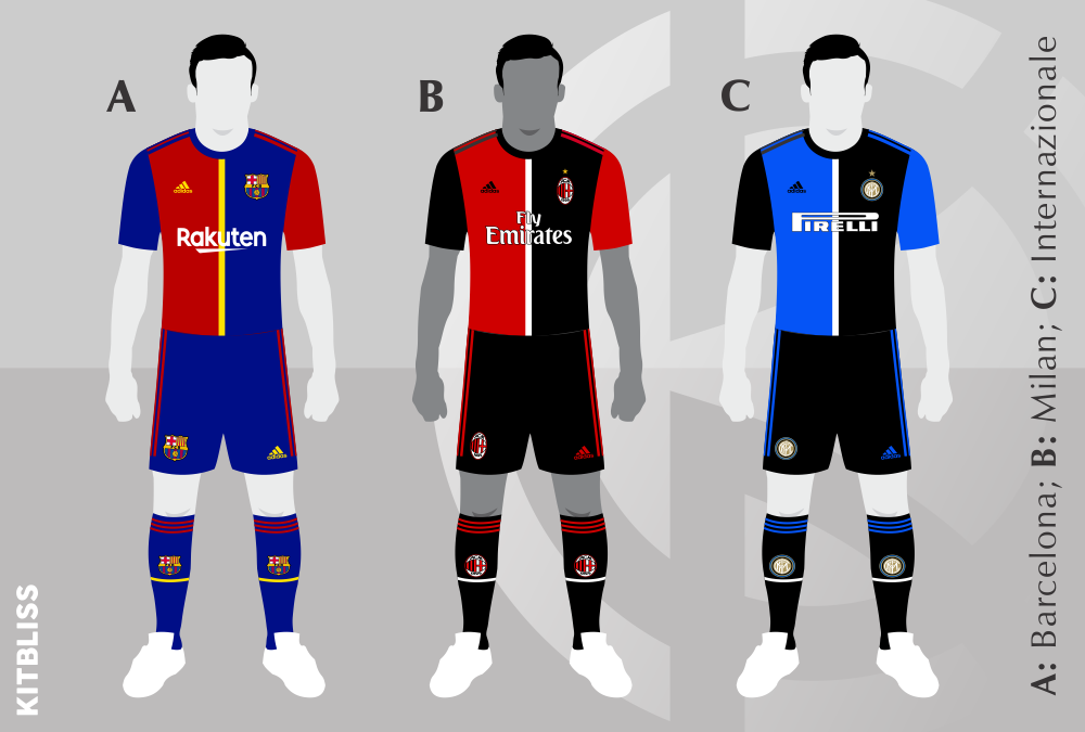
Milan and Internazionale have an additional issue in that their central stripe colour, white, clashes with their respective shirt sponsors. This requires a thin black outline on the Fly Emirates and Pirelli logos, and that in turn detracts from the overall look just a little. Here again, however, halved shirts just don’t reek of all the history that the two Milan clubs can muster.
English football clubs fair little better. Like Barcelona, Crystal Palace have actually worn a halved shirt on one occasion in recent years, so their version of the Adidas halves looks familiar but not really a suitable alternative to the stripes they’re known for.
Both Sheffield Wednesday and Sheffield United have worn black shorts for most of their long history, and those shorts provide much more colour balance in their reworked kit designs. Unfortunately we’re no nearer discovering a halved design that millions of people will be demanding for their clubs in the very near future.
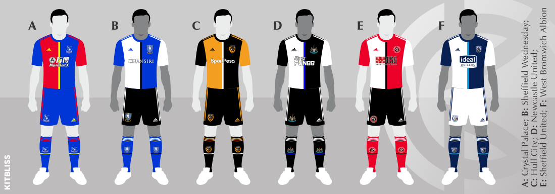
Hull City fall into the earlier mentioned category of a team that doesn’t always wear stripes. The problem with their Juve template, however, is that their traditional amber colouring is eaten up by the more dominant black. Newcastle United and West Bromwich Albion, however, have no such worries and one wonders whether this template perhaps works best for them out of any of the teams mentioned in this article.
As you’re probably aware, very few national teams wear striped shirts, but of those that do Argentina are the most famous. I couldn’t help but mock their kit in the half and half design, and I have to be honest in saying that this kit works rather better than some of Argentina’s other kits that have been worn over the last few years. Would they ever adopt such a radical change, though? Probably not.

Finally, while we’re in a playful mood, I wondered whether the Adidas/Juventus halved design might work well for teams that wear hoops rather than stripes. To that end, I took the finest hoop wearers from either side of Hadrian’s Wall - Celtic and Queens Park Rangers - and gave them a horizontal version of the template we’ve been discussing.
The result, I think, was quite pleasing, especially when considering that the central coloured stripe in many ways works better when turned 90 degrees. As with all the examples we’ve seen here, however, it suffers the same fate, i.e. that the designs look good… but just not for the teams mentioned.

29 November 2019